Lawrence Livermore National Laboratory has updated its energy flow charts to include state-by-state energy use for 2015-2018. It also has released carbon emissions charts that depict a breakdown of all 50 states’ carbon emissions from 2014-2017. See the charts.
Each year, LLNL releases flow charts that illustrate the nation’s consumption and use of energy. This recent release represents a major update to the state-level analysis.
Carbon emissions are broken down in metric tons while energy use is broken down in BTUs (a BTU, or British Thermal Unit, is a unit of measurement for energy; 3,412 BTUs is equivalent to 1 kilowatt-hour, which is the amount of energy it takes to light an efficient LED lightbulb for a week).
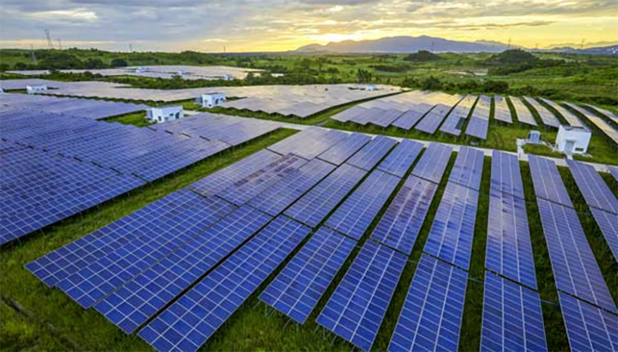
Renewable energy, specifically solar and wind energy, have made huge strides in the energy supply sector contributing to the decrease in carbon emissions since 2014. In states rich in renewable resources such as Iowa, wind supplies make up well over a quarter of the state’s electricity and contributes to the state’s ability to export electricity to its neighbors.
Livermore’s home state of California saw a 21 percent increase in solar power from 2016 to 2017.
Texas saw dramatic reductions in carbon emissions by 2017 with a net decrease of 182.4 million metric tons from the levels in 2014. Meanwhile, energy use in Texas increased by 239 trillion BTUs from 2016 to 2017. Texas saw a 57 percent hike in solar energy and a 14 percent jump in wind energy compared to 2016 levels.
In New York, energy use dropped by 28 trillion BTUs in 2017 compared to 2016 levels. Carbon emissions dropped by 1.2 million metric tons in 2017 compared to levels in 2014. New York saw a 23 percent increase in solar use and a 5 percent increase in wind use in 2017 compared to 2016 levels.
See the state-by-state carbon emissions from 2014-2017 and the state-by-state energy flow charts for 2016 and 2017.
Original post https://alertarticles.info
